DESIGN SYSTEM REDESIGN
UPDATING & ADDING NEW WIDGET
As part of a cross platform redesign we implemented, I was given the task to update the dashboards.
This included updating the look and feel of the dashboards themselves as well as the area where you settings page for the dashboards.
I mapping the different widgets and their settings requirements, taking into considering how they will be consumed in their different states.
As part of another effort, We wanted to add a new widget and had to define the behavior, usability, and design parameters.
BEFORE & AFTER
REDESIGN WIDGET SETTINGS PAGE
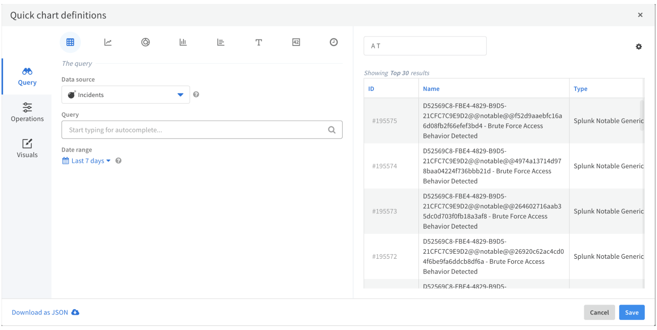
WHAT WE STARTED WITH
The current design system felt a bit outdated. There was an effort redesign the entire platform to create a better ecstatic and improve the usability where ever possible.
QUERY
WHERE WE ENDED UP
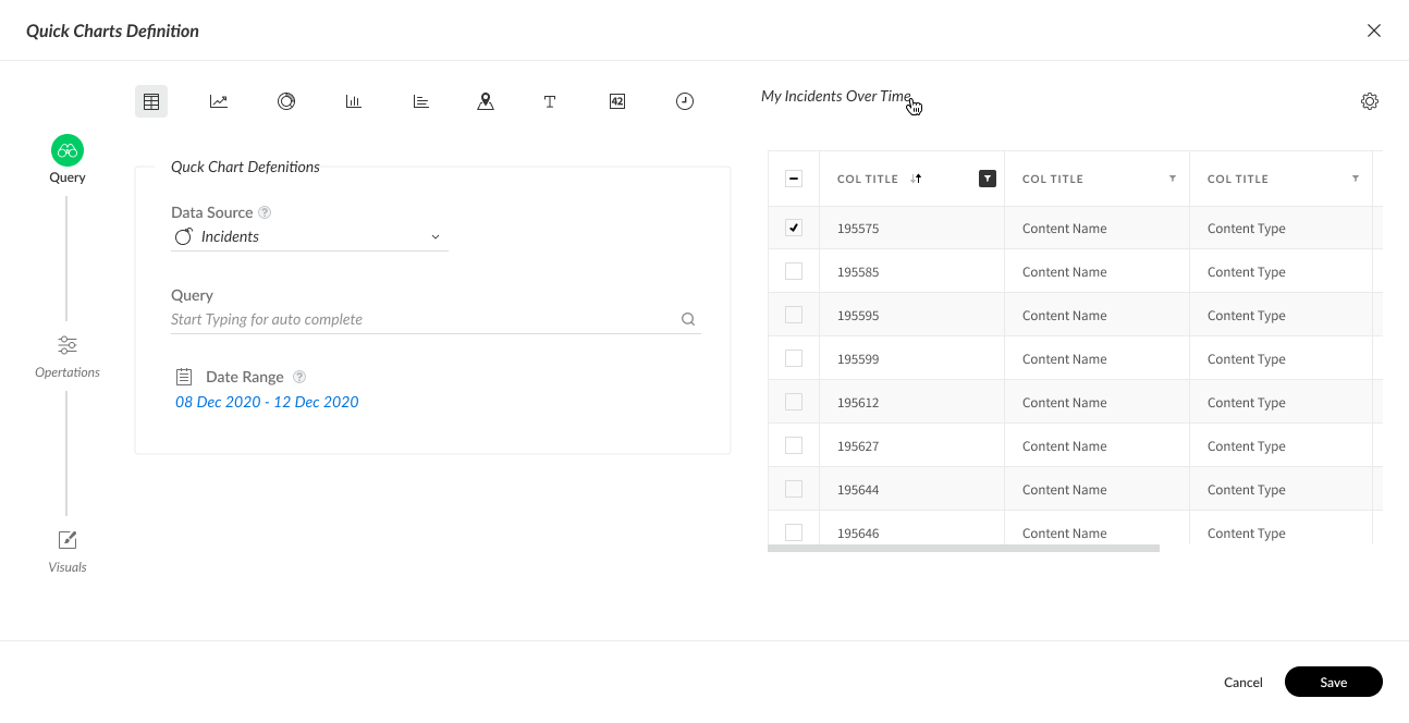
Updated the fields and table design to fit with the new look and feel including icons
Redesigned the left tabs.
QUERY
DASHBOARD WIDGET DESIGN AND MAPPING
WHAT WE STARTED WITH
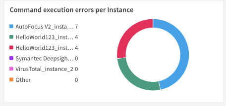
There were some design inconsistencies that had to be mended. There was a need to update the graph behaviors and responsiveness specifically relating to amount of data in limited space.
LINE GRAPH (Before)


WHERE WE ENDED UP
Updated the legend design and behavior
Updated the graph responsiveness the way the data is displayed and consumed
LINE GRAPH (After)


Taking into consideration graph size and the amount of data displayed to a create scalable solution
PIE GRAPH (Before)
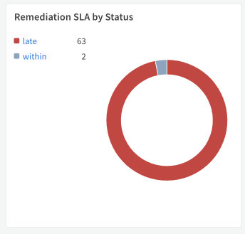
PIE GRAPH (After)
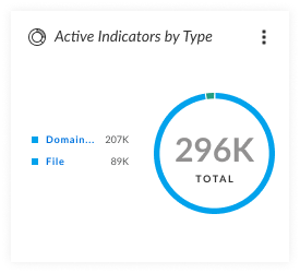
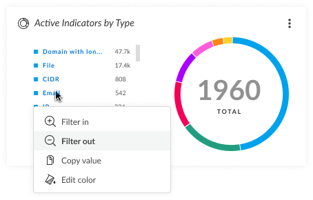
Desigining legend orientation and behavior depending on the amount of information is displayed
Suggestion of adding the total number in the center of the circle
BAR GRAPH (Before)
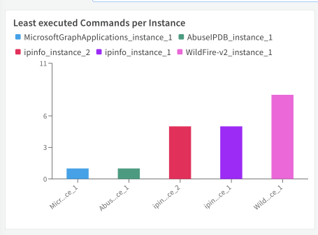
BAR GRAPH (After)

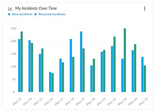
Considering the different ways in which the Graph is used to optimize the design and how it is consumed
BIG NUMBER (Before)


BIG NUMBER (After)
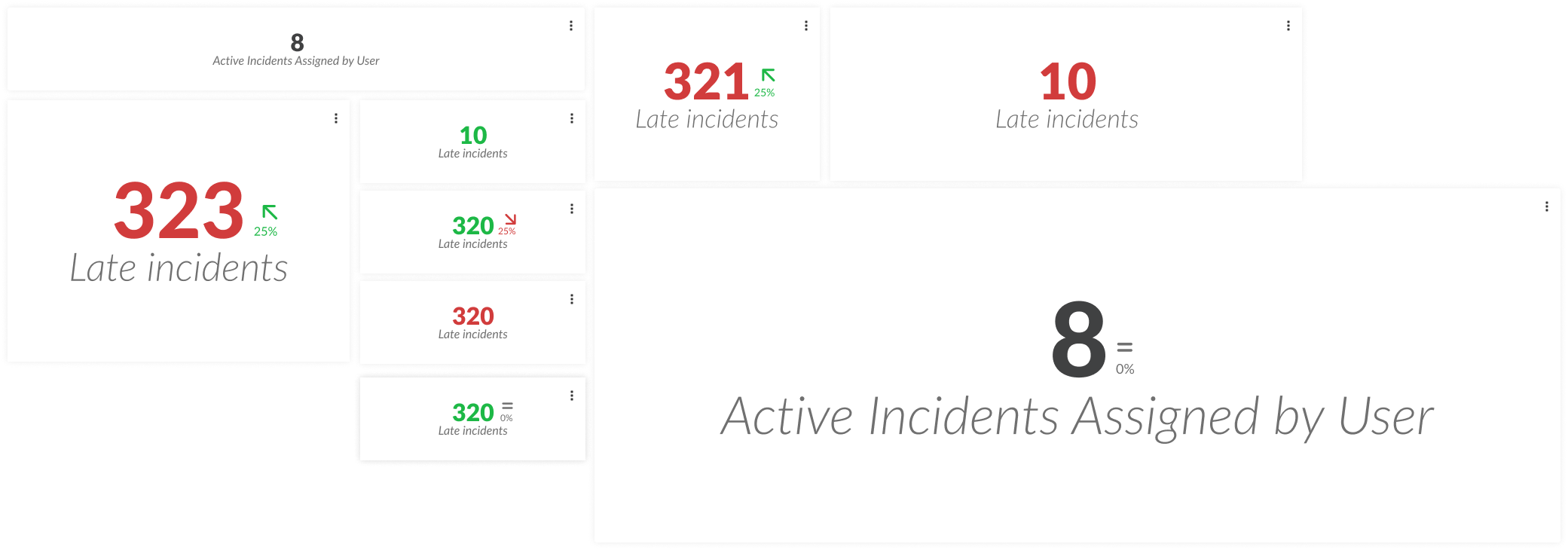
Had to consider responsive design and how it impacts the text size and the overall grid adjusted the visual design to become more subtle redesigned widget icons
WIDGET DESIGN
DESIGNING A NEW WIDGET
We wanted to add a map widget along with the other graph types.
The widget would allow to map where specific incidents were happening.
We needed to allow users to understand not just where most incidents were located, but also which ones were more important to pay attention to.
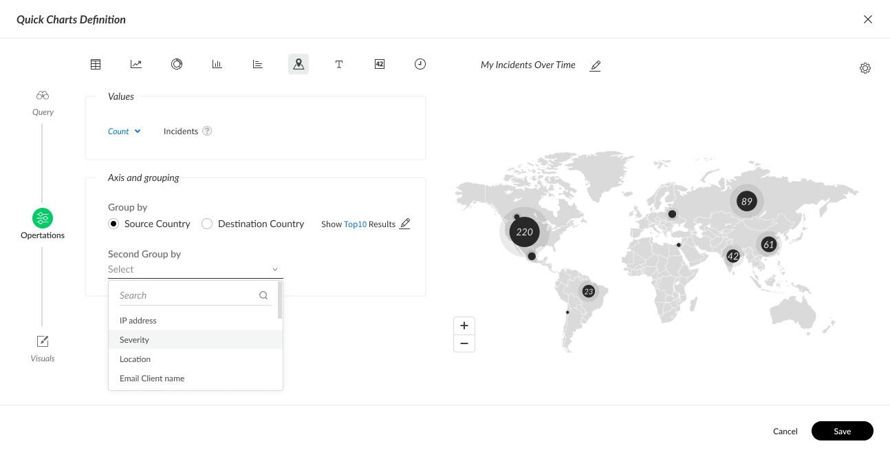
WIDGET SETTINGS
User can set up the type of data to display on the map, adjust the date range and time, select if it is a source country or destination, show percentage or not, and select a second group by such as location severity IP
Defined the behavior of the widget, having the circles auto calculate in relation to the results.
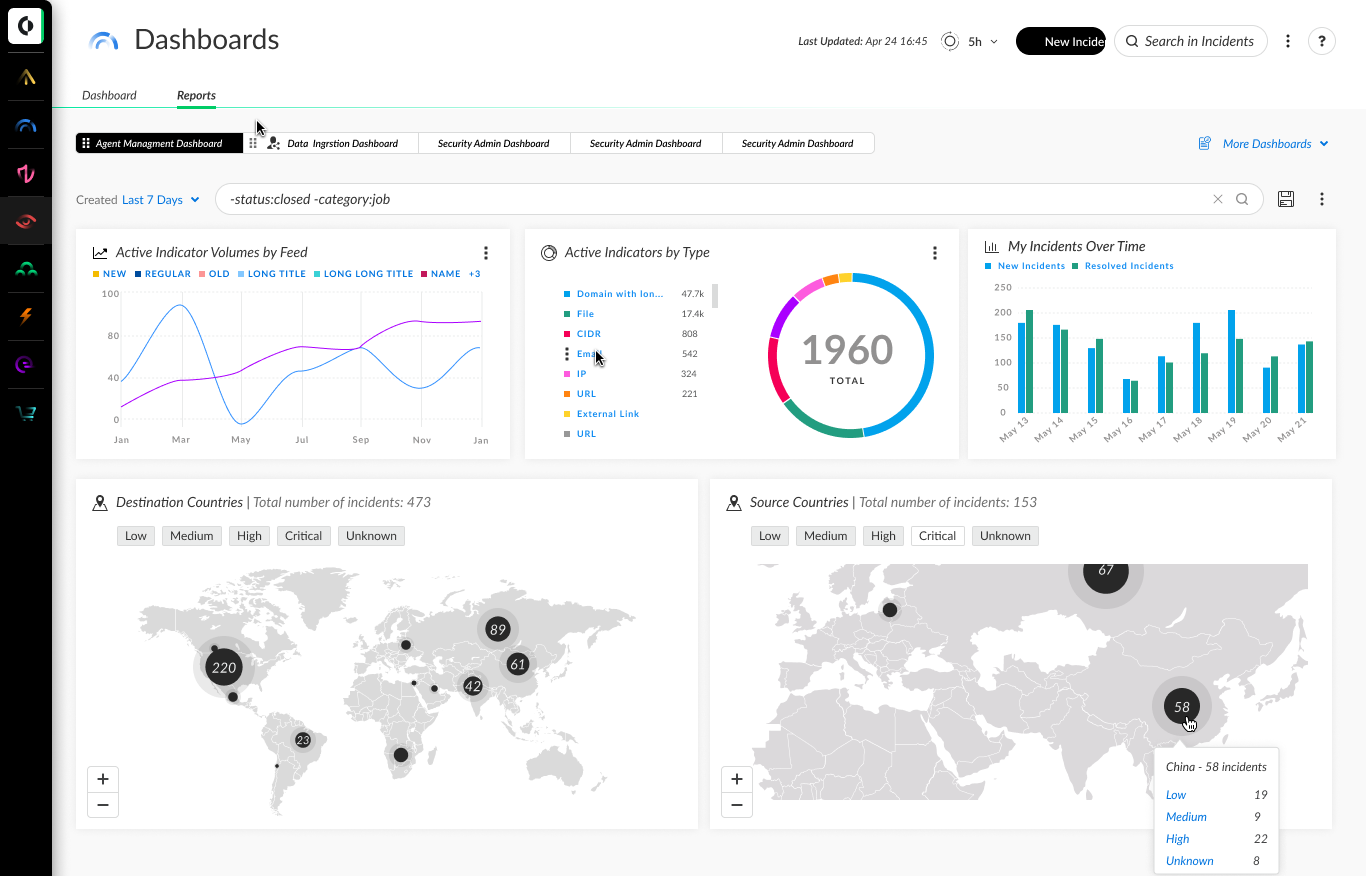
WIDGET SETTINGS
Tool tip will display the breakdown of the group depending on the selection
Data layers turn on/off and not counted for in the circle sum if active
Zoom in and out to easily access overlapping layers
Legend appears when the second group by is applied (in this case severity)