Multimedia Player
UX, Wire-framing and UI brand upgrade
About the multimedia player
The Player enables you to play back various media types of recorded interactions and displays relevant information about interactions as you play them back. Used by supervisors, agents, senior agents, auditors (QM), and analysts.
Its main usage is handling disputes, evaluations, training and coaching and understanding agent/customer behaviors.
Scope of the project
This has been an ongoing project in a corporate setting. At the point where I picked it up, there was a redesign. We based the changes on a customer visit that helped to understand the functionality, the users needed and how to best display the data.
My role included competitor research, concept development, creating wireframes, UI design, visual language and work with the dev team.
My goal was to give insight into some of the features we created and several challenges we overcame.
Where we began
The component had been redesigned several times, each time by a different platform.
Most of the redesigns contained similar functionalities, yet the visual language was different for each one.
Design
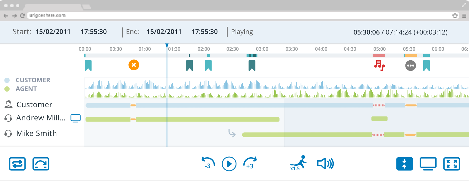
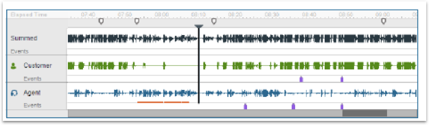
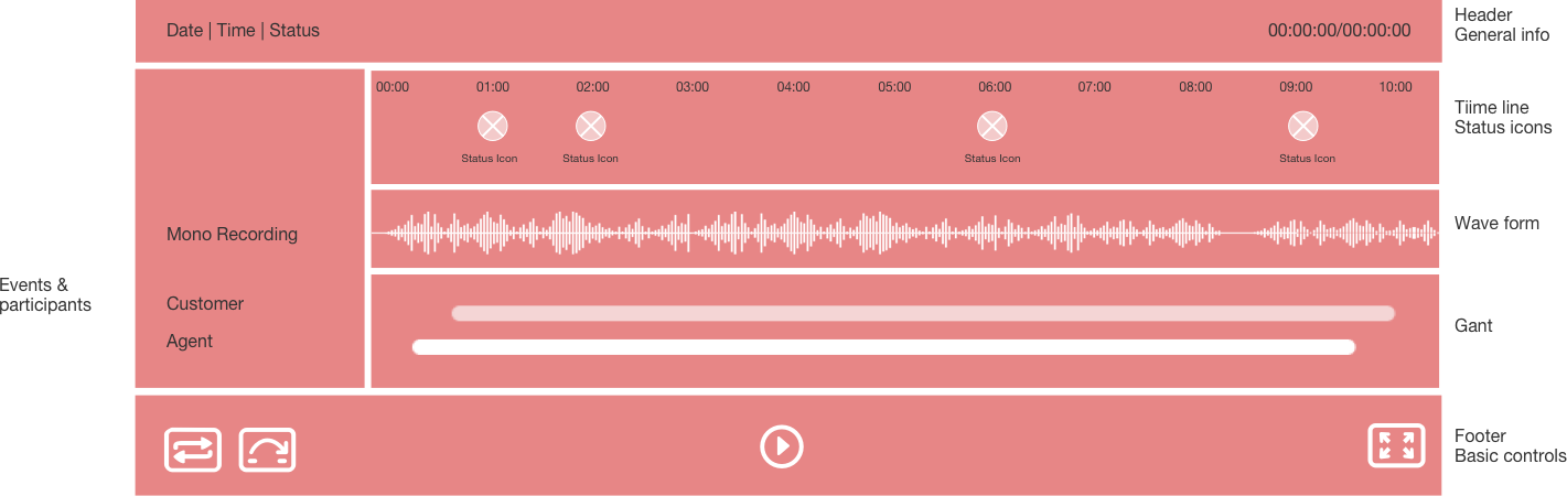
Most calls are between 3-6 minutes, and we optimize the wave form scale to fit the most calls in the organization.
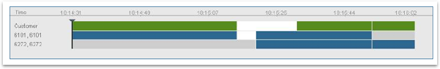
Improved the visual affordance of the call sequence between the different agents and the customers, using a Gantt view as a solution.
Used icons to focus the user on the imporant events that occured in the conversation.
A/B and usability testing to improve what each icon conveys
Layout
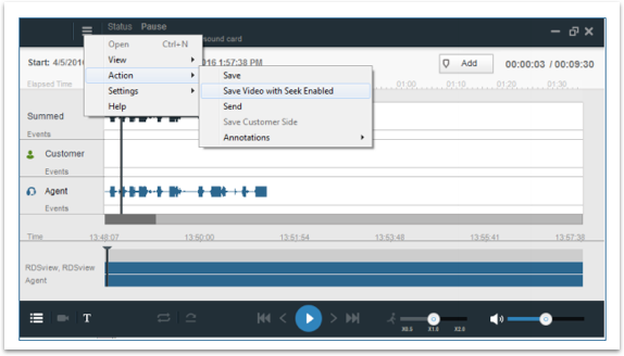
The player is a small secondary pop up window.
The data is distributed on the page allowing the agent to get an immediate overview of the nature of the call, while still allowing specific indications to stand out on their own.
The waveform allows the agent to understand the tone of the conversation, while the Gantt below aids in gaining a more accurate understanding of who was involved. Icons indicate which events and sentiments occurred and where, allowing users to focus their investigation based on specific areas.
Color
I used a pallet that could be recognized with the rest of the company’s brand, with that I worked to neutralize the colors so they would not overwhelm the viewer especially because this is a data heavy component.
So, I used the structure with soft colors and indicators being bolder and switches kept with the visual design language
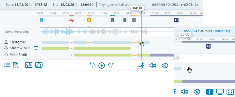
As recording plays it colors in blue

Customer represented in blue
Agent represented in green

Customer represented in blue
Agent represented in green

Switches
Icons played a big role in the functionality. So, I created a switch system for the action pane.
When pressed icons would fill, when released icons would outline.
For the loop button I created a middle stage, because it was a three-stage process and wanted clarity as to which step the user was on.
Indicators
are color coded and are filled rather than outlined to reduce noise.
Player Capabilities
ACW (After Call Work)
The screen recording continues when the call is finished, recording the agent’s call handling. Visually I created a different color and iconic indication to distinguish between the two modes.
In addition, the counter changes its color to indicate the call is beyond the conversation, this is important because it allows a user to easily understand the length of the call and the length of the agents handling time.
Player Modes
Some other challenges we tackled were the many modes and forms the Player took.
From a simple collapsed view to a full capability view with video and full screen capabilities.
Player Zoom
Often there was more than one screen recorded at once. Displaying several at once made it difficult to see the content and actions on the screen.
We used a carousel on the top of the screen allowing the user to zoom into an individual screen or view them all at once. This also gives him context as to where he is at all times.
There are also arrows on the video its self that allow for navigation, especially when the user is in full screen mode and the carousel disappears.